Definitive rankings for every football helmet in the Mountain West
The Statesman sports crew is here at the Mountain West media summit in fabulous Las Vegas, and after a quick run to Sprinkles cupcakes we’re here in the conference center ready to dig into all things MW football. Utah State interviews and reactions to today’s preseason poll are set for tomorrow, which means today we’ve got other business to attend to.
Daniel: First hot take: Sprinkles cupcakes are overrated. Second less-hot take, it’s the offseason, and nothing truly matters. So, instead of ranking a bunch of players that we really don’t know much about how they’ll perform, let’s talk about how they’ll look.
Megan: Instead of focusing on how USU is ranked dead last in every preseason poll, let’s talk about how fabulous these Mountain West helmets are!
D: I mean… I didn’t want to straight up say we’re dead last….
Logan: 28 other folks did. =(
D: But 28 Debby-downers can’t take away how lit our helmets look!
WEST DIVISION
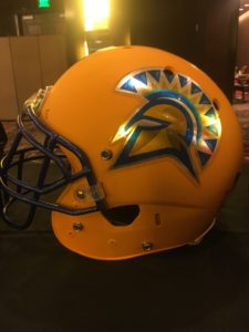
San Jose State Spartans
Jaden: Much like San Jose State’s basketball court, this is an enormous blown opportunity by the Spartans. Their awful uniforms and color combinations aside, this helmet is simply dreadful. With a mascot like the Spartans, there is so much potential for a BA Persian War-themed design. But much like the Battle of Thermopylae, the underdog Spartans will not defeat Xerxes and the Persian army (San Diego State).
D: Apart from the allusions to mustard the helmet brings up, I don’t feel like these are THAT terrible. Definitely not good, but there are easily worse helmets out there, even in the conference.
M: I’m just wondering why they made the base of the helmet yellow and then tried to cover it up with an awful metallic sticker.
L: I’m with Megan. The flat yellow looks like a youth skateboard helmet with shiny stickers slapped on it from the local bowling alley’s little sticker vending machine. Waste of a great facemask. That said, this isn’t my last place helmet in the West division.
D: That feels like an insult to bowling alleys everywhere. Scores out of 10, what’s everyone’s? I’d probably give these about a four.
L: It’s gonna be a 2/10 for me.
M: 2/10
J: 1/10. Mostly because of wasted potential.
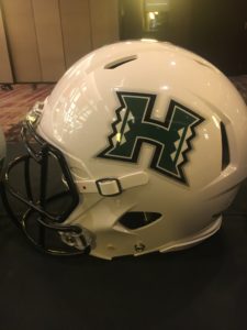
Hawai’i Rainbow Warriors
L: So much potential for a dope Hawaii Rainbow Warriors helmet, and instead there’s this. The patterned stripe down the middle is kind of cool, but how are Hawaii’s helmets not green? White helmets rarely work. This looks like the safest possible option for a team with a great logo and mascot. 3/10
D: Hawaii’s helmet looks like the default helmet in an NCAA Football video game for some fake team like the Tiburon Sharks. Generic stripe. Generic ‘H’ on the side. White base. There’s just not a ton of imagination in play here, and when your mascot involves rainbows, there needs to be.
J: I’m with Logan, I dig the triangle-pattern stripe down the middle of the helmet. But there is no way around the fact that they DON’T have a rainbow on their helmet. Get on it, Hawaii.
M: Not lit.
D: These register a 2/10 for me. Hawaii deserves more. We deserve more.
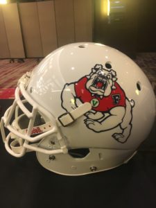
Fresno State Bulldogs
M: I hate the bulldogs and the white background is nothing short of bland.
L: These are the helmets a high school team wears in a movie that isn’t about football. 0/20
D: Fresno’s bulldog mascot looks like they took the bulldog from those old Tom & Jerry cartoons and made a sticker. A zero for me would be like one of those old leather helmets from the ‘20s, so I’ll give a 1/10 here.
J: This helmet and logo is an exact representation of how I feel about Fresno in general: It stinks. 2/10.
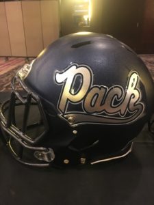
University of Nevada Wolfpack
L: Some discord here about what comes second versus what comes third in the West division. Ultimately I had to place Reno’s helmets behind Vegas for reasons that ought to be evident (it’s Reno). The “Pack” sticker on one side is supposed to be some sort of wannabe cool throwback that just doesn’t land, much like coach Jay Norvell’s photo on this year’s media guide. 5/10
M: The overall color and texture of this helmet is superb. It’s simple, but gets the job done. However, I’m not a fan of the “Pack” sticker. 7/10.
J: I actually dig this helmet. Maybe that’s just because it’s Aggie blue. But I think the metallic Wolfpack logo is sleek and with a chrome facemask it could be even sweeter. Unpopular opinion alert: I’m actually alright with the “Pack” sticker. So sue me.
D: I really hate the “Pack” lettering on one side, but I really love the wolf logo on the other. It’s like a group project where one guy knew what he was doing and put in some quality work and the other guy was some dude named Boris. 6/10
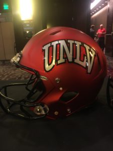
UNLV Rebels
D: The biggest plus here is that they didn’t include the overly cartoonified, moustached cowboy on this.
L: I’m a sucker for metallic red, so long as it’s not too extreme. This is a decent looking helmet that looks good on its own and in large group huddles, and the “Welcome to Las Vegas” sticker on the back is especially excellent. Kind of disappointed in the flat grey UNLV sticker, but it’s not as offensive as another team we’ll get to later. 5.5/10
J: I’m fine with the “UNLV” script logo on one side of the helmet. But it’s a flat out shame that there isn’t a stripper heel on the opposite side.
M: I am a huge fan on the metallic texture of this helmet and black chrome facemask. I also love the “Welcome to Las Vegas” sticker on the back of the helmet, but, hey, I would still never want to attend UNLV. 8/10
D: Honestly, I don’t get the hype with this one. The red looks nice, but it also looks nice on like 30 other teams across the country. And the UNLV sticker on the side is lacking in my opinion. It looks nice, it’s pretty sharp. But it’s been done before by every university with a red base color scheme. 6/10
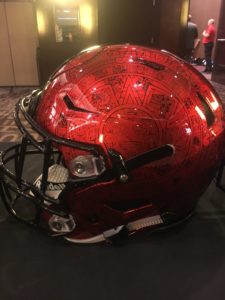
San Diego State Aztecs
D: Pack up. Let’s go home. This one wins.
M: The tribal print is delicious and light years ahead of anyone else. And this is obviously always one of the best teams in the Mountain West. 10/10.
J: This is very clearly the holy grail of Mountain West football helmets. In my opinion probably one of the top 10 helmets in the nation. As easy as it is to hate the Aztecs, it’s impossible to hate this helmet.
D: This is the style we wish Hawaii would have gone with. This is the detail we wish San Jose would’ve integrated. This is the sharpness that UNLV achieved, but with infinitely more imagination. Basically everything you want a helmet to be, and everything we’ve dinged everyone else on for not doing, the Aztecs did. 10/10
L: Utah State would be trying for a threepeat this year if they had helmets this fresh. 10/10
MOUNTAIN DIVISION

Air Force Falcons
M: Although I’m a big fan of the metallic finish, the lightning bolt sticker is lame. Time for an upgrade. 4/10.
J: And the award for coolest alternative helmet but worst actual helmet goes to: Air Force. The Falcons’ fighter plane shark teeth helmet is one of the coolest things to ever happen to college football, but their everyday lightning bolt helmet leaves much to be desired. You can do better. 3/10
D: Air Force opened up a Word document, opened up ClipArt, and put in the first lightning bolt picture they could find. Looks like it sounds. 3/10
L: Underrated azure helmets ruined by the worst stickers imaginable. This is the reverse of the SJSU hat. Wear the fighter plane helmets always. 2/10
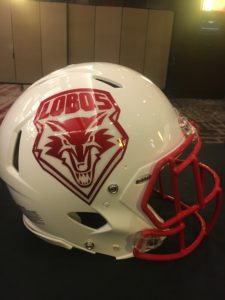
New Mexico Lobos
M: Can we please stop with the white helmets. They look like something a high school team would use. I also think the Lobo sticker could use an upgrade. 4/10.
D: White helmets can look good. You just need an impressive logo on the side, an inventive stripe design, and a slick facemask. New Mexico, you didn’t do any of this. 4/10
J: Meh. New Mexico’s logo, helmet, and color scheme are almost as bland as Albuquerque. Not the worst helmet ever, but there’s really nothing special about it. 4/10
L: Oh shoot, Jaden going in on the entire city of Albuquerque. And he’s not wrong. 3/10
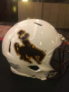
Wyoming Cowboys
M: Although this is lower down on the list, I actually like this helmet. This is the prime example of how a white helmet can be somewhat appealing if you dress it up right. I am still not a fan of the brown and yellow school colors, though. 7/10
D: Agreed, this is a classy helmet. Disagreed on the color scheme, though. The brown facemask completely makes it. Plus, the cowboy logo is low-key one of the best in the conference, as well. 7/10
L: For having the worst colors in the conference, Wyoming produced a quality helmet. The stripe is just right, the logo is easily recognizable and it wouldn’t make sense for Wyoming to be flashy or eye-catching. 5/10
J: Wyoming’s helmets are a classic. It’s hard to make a cool helmet when you have to work with those awful colors of brown and yellow, but Wyoming nails it and I can never imagine them wearing anything else. 7.5/10
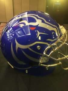
Boise State Broncos
M: They have the right idea going on with this helmet, but it’s a bit too busy. Maybe tone down that Bronco a bit? 7/10.
D: They did tone this down. Have you seen their field?
J: I’m with Megan here. I really like the old Boise State helmets, and these aren’t awful. But they’re trying to do too much and I think the helmet is the weak spot in an otherwise awesome uniform. 6/10
D: I’ll give the credit that this is one of the few occasions where the team makes a horse look intimidating, despite its chubby cheeks. Is it a San Diego State-level execution? No, but let’s be honest, Boise hasn’t achieved that in any category for some years now. 8/10
L: The chubby-cheeked Bronco logo will never look intimidating, even in this chromed-up oversized look. Boise could probably pull off chrome facemasks or the asymmetric logo design, but not both at the same time. I can only assume these exist to draw attention away from the most hideous field in college football. They don’t. 6/10
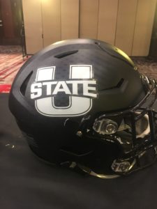
Utah State Aggies
M: I love the simplicity, but yet fierceness of this helmet. I can picture Dallin Leavitt mauling someone over in it right now. 9/10
D: We’re all a little biased here, but I think this is the best helmet in the conference in reference to detail. The matte finish of the blue is sick looking, but looks even better when you get close enough to see the sort of fracturing dots pattern throughout the helmet. The chrome finish on the facemask is slick as ice. Overall, it’s the role player helmet. Not super flashy, but it doesn’t mess anything up. 8/10
J: It’s simple but sooooo beautiful. No, I’m not biased. Utah State nailed a very simple logo and color scheme perfectly. There’s nothing more beautiful than USU’s blue helmet with a chrome facemask under the bright stadium lights. 9.5/10
L: The helmet is virtually flawless, though an alternate with the bull logo would be pretty incredible. SDSU’s Kameron Kelly mentioned aside of San Diego’s helmets, Utah State’s were the best, so I feel okay about the homer pick. 8/10 with the all-white unis. Stop crying for a matte black helmet, USU fans — it’s not in the color scheme. Now if they would just stop wearing white jerseys with grey pants…
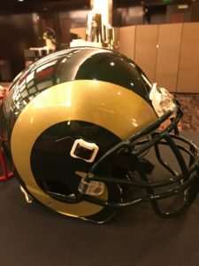
Colorado State Rams
M: This helmet easily tops the Mountain Division. The green and gold color-scheme compliments each other perfectly. 9/10.
L: Solid. Under-appreciated. The Ram horns are easily identifiable, the sparkly gold works, and the more subtle green finish is complementary without going over the top. These make for a great look no matter what uniform combo CSU trots out. 8/10
J: As visually appealing as this helmet is, I will not reward them for blatant plagiarism of the St. Louis/Los Angeles Rams. Sorry guys. 3/10.
D: In all seriousness, 75 percent of MW helmets would be infinitely better if they simply plagiarized from other schools and NFL teams. Slap a Michigan State helmet on SJSU and it’s already better. Colorado State realized they couldn’t come up with anything better than this simple, elegant design and was smart enough to not even try. I’ll reward that. 9/10