
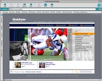
USU Web site gets a face lift
Gray, white and Aggie blue?
Many students were surprised when they first logged onto the Utah State University’s new Web site and discovered the predominate color – gray.
“I have always associated Utah State with blue and white so I was surprised to see gray in the mix,” said Tanya Collings, a sophomore majoring in English. “The changes will take adjustment because I am used to thinking of the university in association with blue and white.”
Thinking is what the school is promoting through its campaign which is incorporated in the Web site, said John DeVilbiss, executive director of public relations and marketing.
The university campaign is about changing the way viewers think and the new Web page is doing just that.
Mid-December the Web site underwent cosmetic change, although very little content was altered. The new look incorporated better photography, layout, and design, said Charles Thompson, university webmaster.
“The new Web site is prettier but no more functional,” said Jonathan Hemingway, a senior majoring in interdisciplinary studies.
Before Thompson there was no official webmaster. He was hired August 2001 and his first project was to redesign the Web site.
Thompson’s goal for the site is to make it fast and easy to use which was accomplished through the first redesign. The more recent changes are mainly for aesthetics. Three years is the shelf life of the current look.
Thompson developed the new look mainly with the help of two students, Kirk Earl and Jared Stanley, in six months.
Earl, the project’s graphic designer, has his work displayed in the Salt Lake City airport. He created dioramas on display about the space program and USU. DeVilbiss refers to Earl as “the in-house genius.”
Thompson said, “Kirk is absolutely the best designer I have ever worked with, besides being a student.”
Stanley, who recently graduated, developed the flash portion of the Web site. He also created the news ticker which displays university news at the bottom of the home page. As part of his portfolio, Stanley used the Web site project, and was hired by MTV and is now working in New York City.
“He is a phenomenal programmer student,” Thompson said. “I’ve been building Web sites a long time. I’ve built a couple Fortune 500 Web sites, other university campus Web sites, but I [came] to Utah State and [found] the best visual designer and flash programmer.”
Thompson said he has worked in many places, including Seattle, Wash.
“I think through this project we set a precedence to hire talented students, pay them good money, and give them a chance to work on really great projects,” Thompson said.
The web pages which incoming students are most likely to visit were transferred into the new template first, which include admissions, the school of graduate studies, and financial aid.
“That’s the priority right now,” Thompson said. “We want to build a connection with a student who’s deciding which school to attend.”
DeVilbiss said the Web site is the university’s front door.
“More than anything we want students to feel like it’s a door they want to knock at and it’s also hopefully a portal. What we really want it to portray is the quality of education USU has,” he said.
Some current students think the new look will help attract future students and reflects the value of education at Utah State.
“I remember applying for college. Brigham Young University’s Web site seemed more advanced than Utah State’s but now Utah State’s is more eye-catching for incoming freshmen,” said Matthew Ethington, a junior majoring in accounting. “The Web site is more welcoming and better represents the high quality of education at this institution.”
A virtual tour will be added in June to help future students visualize themselves attending classes and participating in student activities. In the past, virtual tours consisted of looking at pictures online, but instead this project is segments of a reality TV series focusing on different campus activities.
“We shot a football game where we followed a student around and all his friends from the tailgate party, all through the game and afterwards. It’s just wild and crazy and really showcases what student life is about,” Thompson said.
When focusing on the College of Agriculture the segment included interviews with the makers of the mule clone.
“You almost get to play with the mule on the camera,” Thompson said.
Attracting new students as well as pleasing everyone was the goal accomplished through incorporating the new look, the virtual tour and the THINK campaign.
“We didn’t want this to look like any other Web site. We wanted something to appeal to 18-year-olds. There is a certain degree of professional but combined with a certain degree of youthfulness. It’s just fresh,” Thompson said.
DeVilbiss said through the THINK campaign they are asking people to think about USU. Two years ago the Dan Jones survey showed people don’t really know what USU is. DeVilbiss said he wants people to know about the quality of education at the university and the goal of the Web site is to reflect this ideal.
Thompson said the Web site is an extension of the university’s brand and hopefully the site will get people to start thinking about USU.
Since launching the new Web page many have shared their thoughts about the Web site.
“A lot of people e-mailed in, and the more comments the better. Some negative comments came in and we’ve already made some changes” Thompson said.
He said more feedback will improve the final product.
-lindseykay@cc.usu.edu